
CLIENT
See Tickets
MY ROLE
UX Researcher
UX Designer
DURATION
6 months
ABOUT
See Tickets is an American ticket exchange and streaming platform. It provides services for buyers of tickets for sports, concerts, theater, and other forms of live entertainment.

Discovery
As a result of the 2020 pandemic, millions of concertgoers found it difficult to attend live performances. See Tickets used this opportunity to improve a noticeably cumbersome experience.
Project Goals
Introduce app and web optimization
Provide live streaming for entertainment acts
Offer helpful tools to assist users with ticket purchases.
User Research Summary
I conducted several interviews and created empathy maps to understand the users I’m designing for and their needs. The primary user group was working adults who are restricted to travel. This user group confirmed initial assumptions but research also revealed that travel was not the only factor limiting users from attending concerts.
Interest, costs, and language options were also a challenge. The competitors to See Tickets are Ticket Master and Stub Hub which are American ticket exchange and resale companies. Also, Verzus is a competitor, an American webcast series (live broadcast).
Key Metrics
Number of people who created a See Tickets app account
Number of people who do not complete checkout
Devices used by visitors to See Tickets app
Ticket sales over time
Zip-code
User Pain Points
The platform was not equipped with language options.
The original checkout process was too lengthy.
Users did not feel comfortable with the original ticket pricing model.
Affinity Map
An Affinity map is often used to group related observations together. I used it to surface several key issues common amongst participants.

Wireframe
Paper & Digital
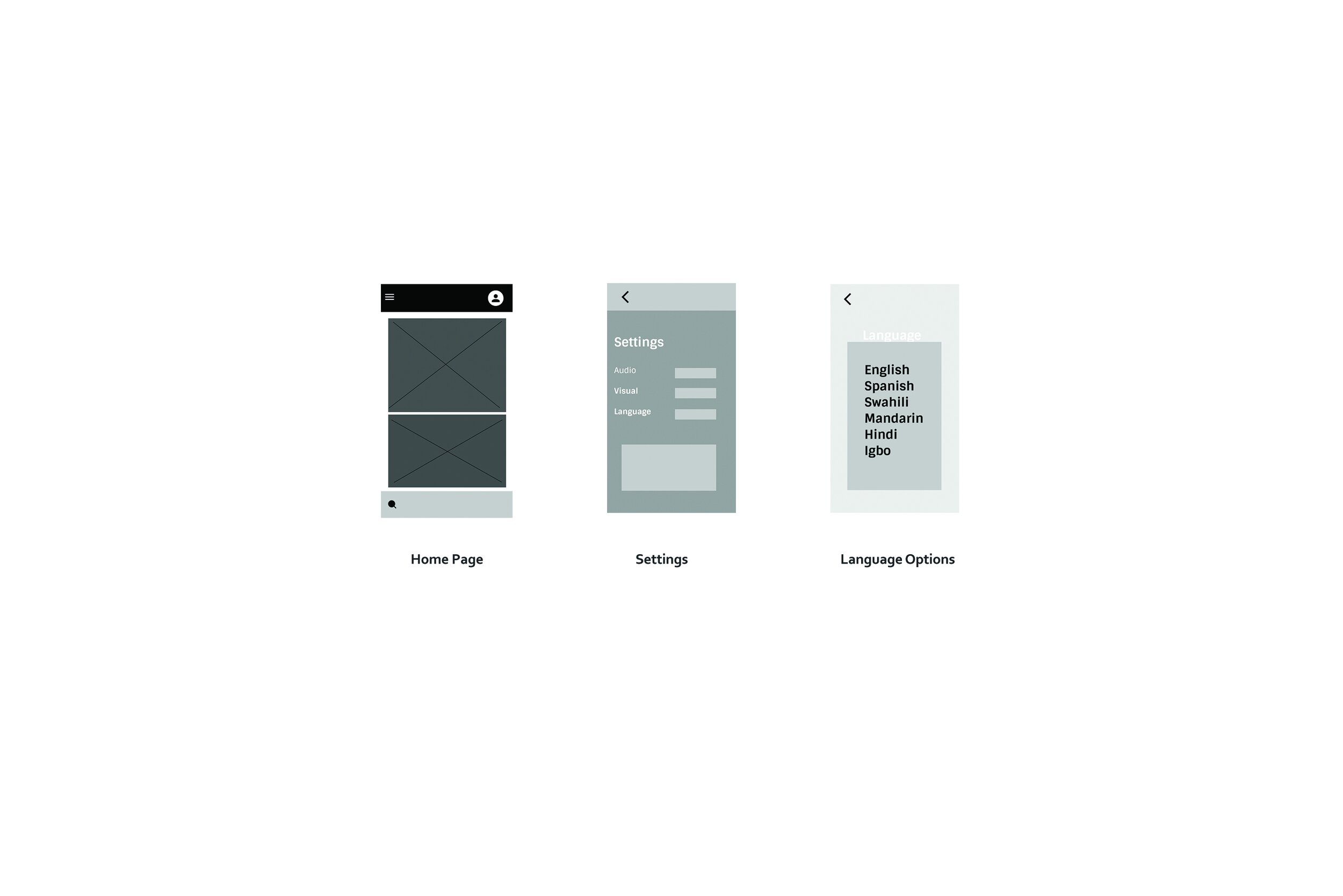
Taking the time to draft each screen on paper ensured that I would address the user’s needs. Simplicity. The low-fidelity wireframe illustrates a quick and seamless ticket selection date.
The wireframe below illustrates how I resolved one of the three user pain points, language options, which can be found by selecting the menu in the top left corner on the Home page.

Mockups
I set up a high-fidelity, clickable prototype using Figma to help aid the customer conversations and also provide usability insights. In the photos below I selected a vibrant green for the “Get Ticket’s” button since purchasing tickets is the primary focus.
Typically, green is associated with a positive outcome- an action that is complete.
Visual Design
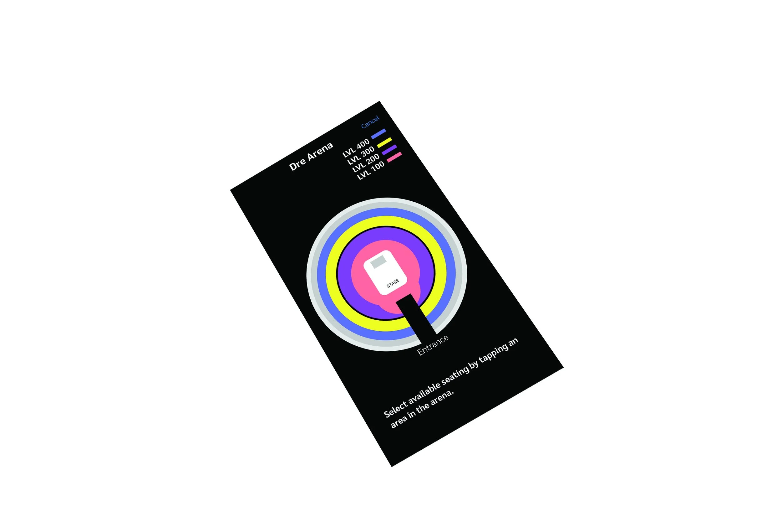
I pushed the visual design as much as possible all while staying within the perimeters of the brand. At this stage, we were refining the seating area and ticket purchase visualizations based on user feedback. A custom 2-D seating chart was created so users can easily identify, select, edit, and or cancel by tapping the colored bubble(s).


Usability Study Findings
Convenience - Users want to purchase tickets and watch high-level performances from anywhere in the world.
Customization - Users want more language options.
Cost - Users want attractive pricing.
Thank You.


